Seatrade Cruise Website Redesign
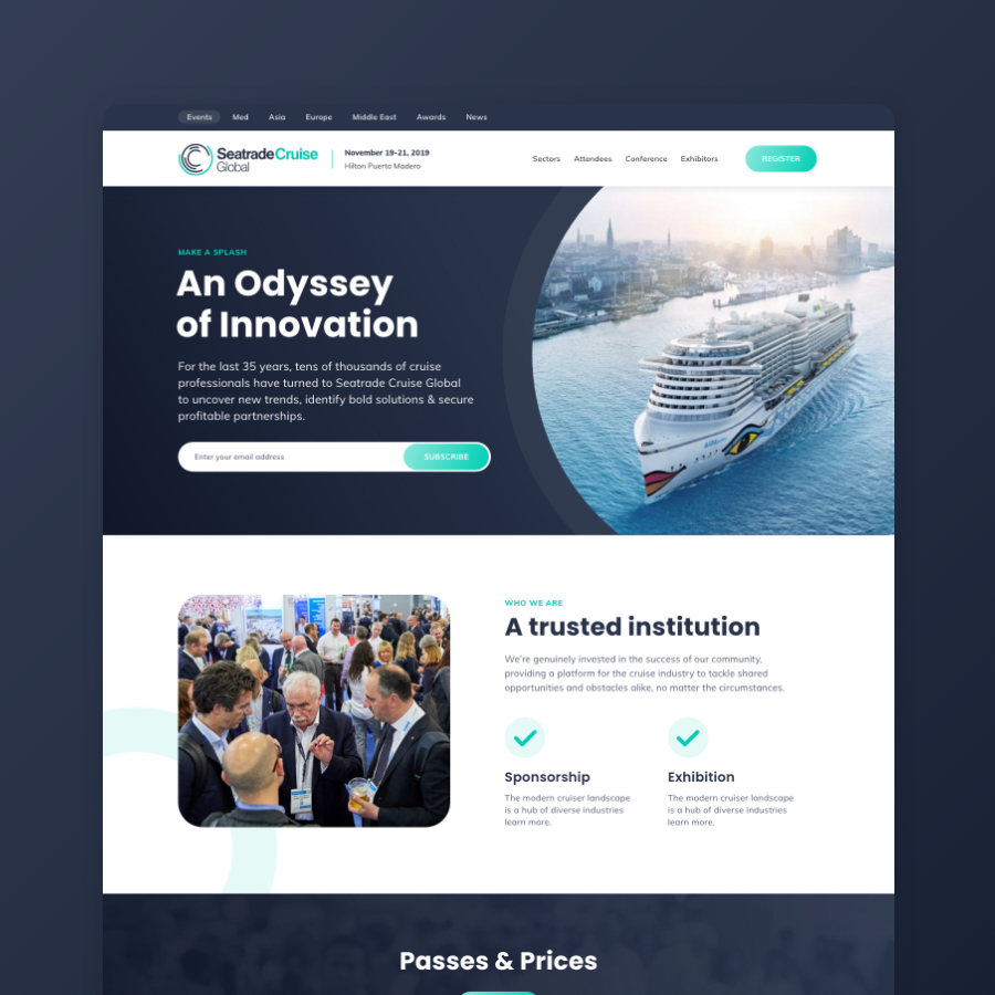
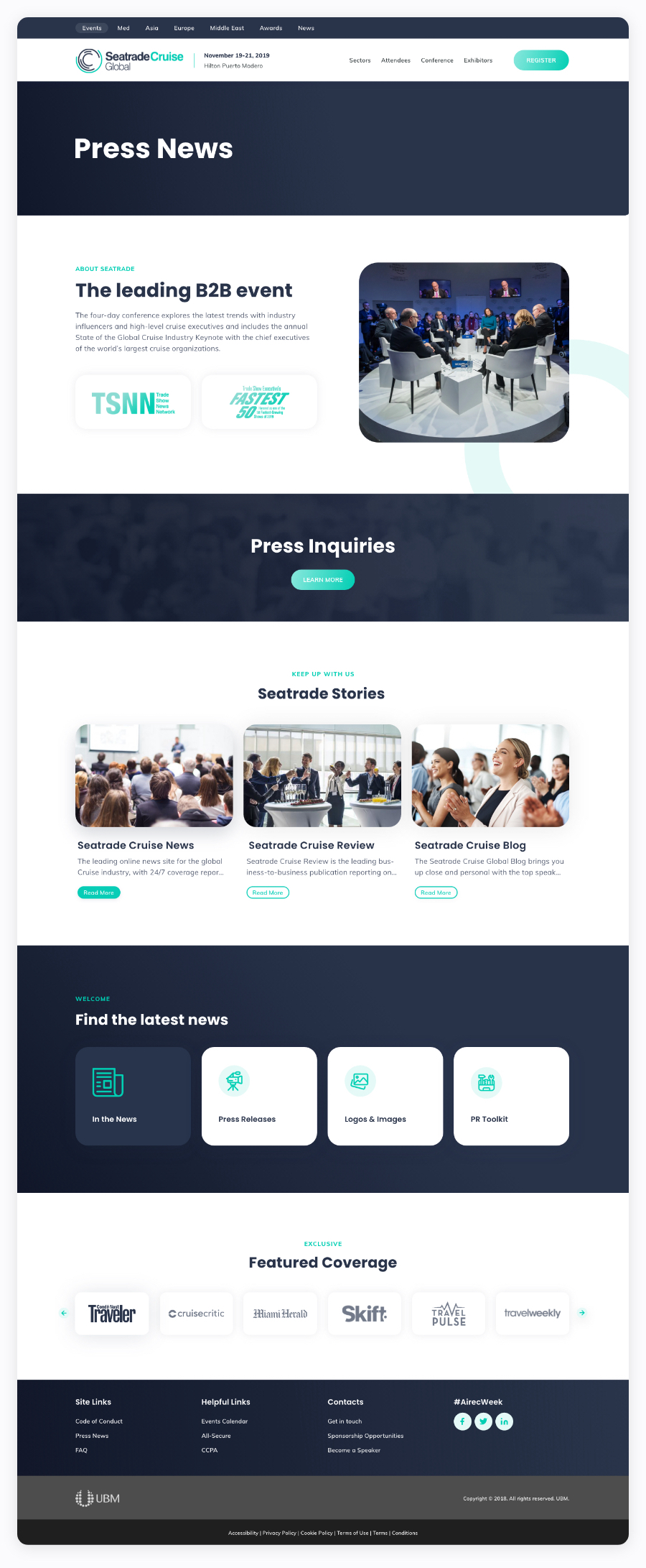
Understanding a rapidly growing industry. I was tasked with a project to redesign a site that markets renewable energy. This included a shift in brand, which now exemplifies growth and welcomes fresh innovation, while still conveying a clear connection to motion in nature.
The problem solved. There were two overall issues that I had to tackle. I needed to solve the confusing journey run by pages overloaded with redundant content. The other being a total interface revamp.
Sitemap + Content Strategy. Using Octopus.do I created a unified sitemap, reestablishing a structure for the site by designating main focal pages with appropriate content.
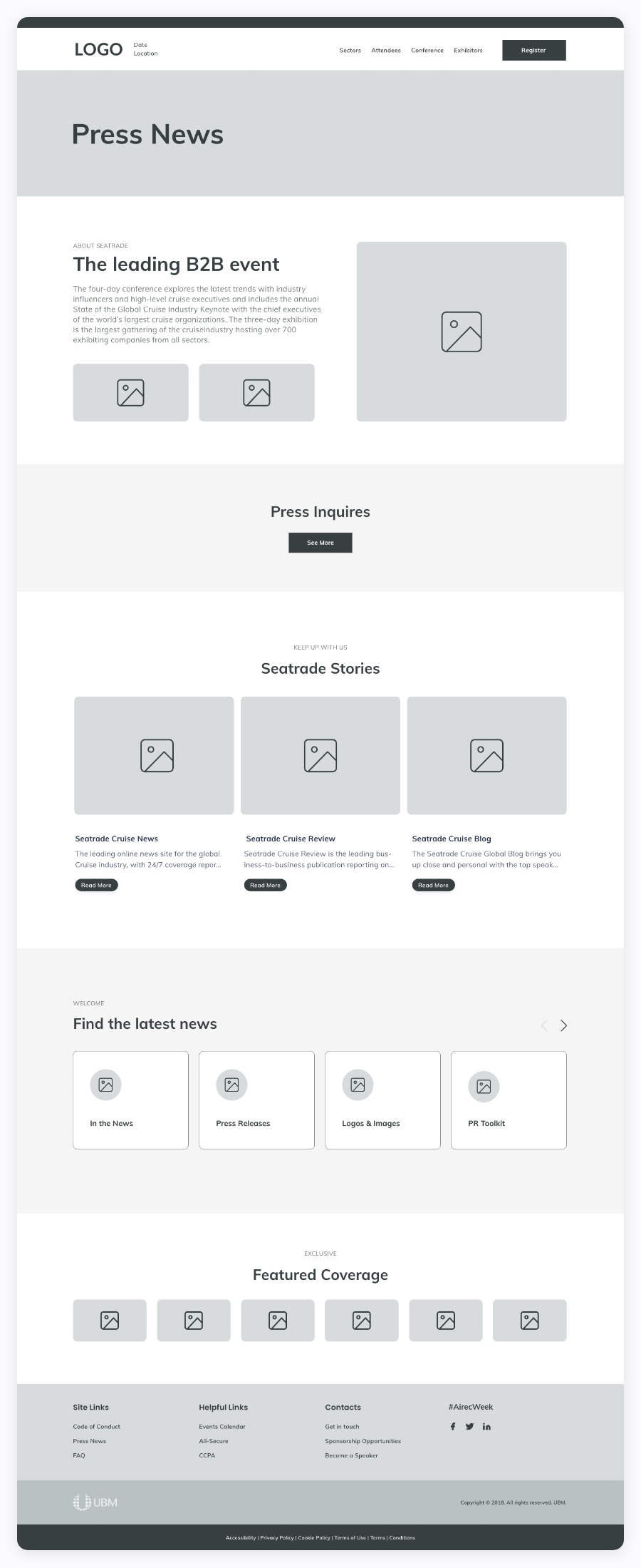
Wireframes + Component Guide: Using Adobe XD, I translated the carefully thought-out sitemap into detailed wireframe page layouts, showing basic user experience. Then, I was able to create a component guide which eventually formed the basis of the atomic design system.
TOOLS | Adobe XD, Photoshop
CLIENT | UBM


